

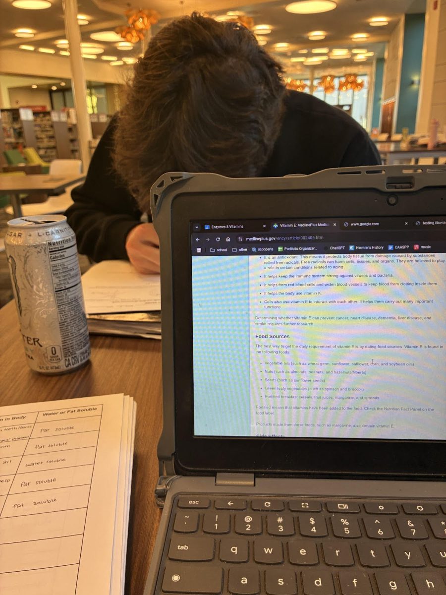


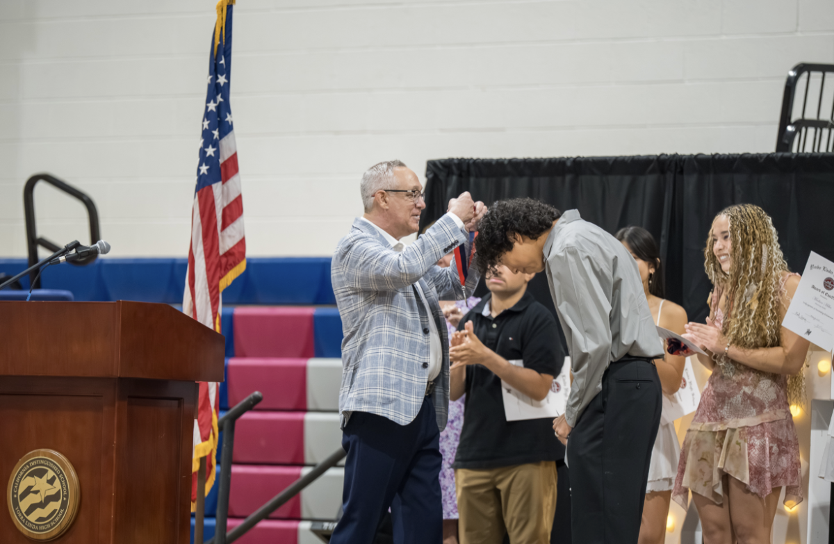
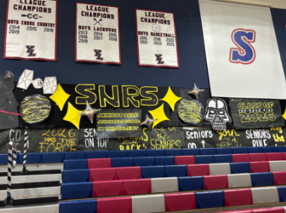













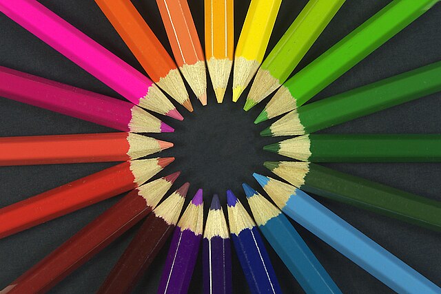
Walk through Yorba Linda High School and you’ll see color everywhere – blue and silver spirit gear, neon Post-it notes, pastel water bottles, and black hoodies. At first glance, these choices might seem like simple personal preferences. Yet psychologists argue that colors carry far more meaning, quietly influencing our moods, behaviors, and even the way we present ourselves. This field, known as color psychology, has become a powerful tool in advertising, education, and even mental health.
Red
Bold and commanding, red is one of the most stimulating colors in psychology. Studies show it can raise blood pressure, quicken breathing, and heighten awareness. It represents passion, excitement, and love, but it also signals urgency and danger. That’s why it appears on stop signs, fire alarms, and clearance sales. In fashion, red is often chosen for its ability to draw attention and create confidence, though in a school setting it can sometimes increase feelings of stress.
Blue
If red excites, blue calms. It is linked to peace, stability, and trust, making it a favorite in corporate logos and hospital walls. Blue tones are said to lower tension and encourage focus, which is why they’re often recommended for study spaces. Psychologists also note that people consistently rank blue as one of their favorite colors worldwide, suggesting it has universal appeal. Wearing or surrounding oneself with blue often communicates reliability, honesty, and control.
Yellow
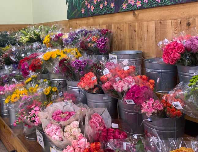
Bright and energetic, yellow is commonly seen as the “happy” color. It sparks creativity, optimism, and warmth, which is why it appears in highlighters, sticky notes, and emojis. However, yellow is complex – it can inspire cheerfulness in small amounts but cause frustration or unease when overwhelming. For this reason, it is best used in moderation, acting as an accent that brings vibrancy without overstimulation.
Green
Green bridges emotion and nature. It symbolizes balance, growth, and renewal, often linked with feelings of harmony and relaxation. Psychologists say green tones can reduce anxiety and help restore focus, which is why parks and natural spaces are associated with peace of mind. In design, green is also tied to health and wealth – think of its use in eco-friendly branding or on money.
Purple
Often seen as a blend of the boldness of red and the calm of blue, purple represents imagination, spirituality, and luxury. Historically, it was a color of royalty due to the rarity of purple dyes, and today it retains its connection to creativity and prestige. For students, purple can feel expressive and unique, a color that stands out without overwhelming.
Black and Gray
Neutral colors like black and gray might seem simple, but they carry their own psychological weight. Black often represents power, sophistication, and authority, which is why it dominates formal wear and luxury brands. At the same time, it can suggest secrecy or mourning. Gray signals neutrality, practicality, and maturity, though too much of it can come across as dull or draining. These shades often create balance, allowing brighter colors to stand out.
Everyday Impact
The influence of color shows up in ways most students rarely stop to notice. For some, it’s the way slipping on a bright red hoodie before a presentation feels like a shield of confidence, making their words come out stronger. For others, it’s the calming effect of a blue binder during a stressful exam week, a quiet reminder of order in the middle of chaos. Even the choice of highlighter – yellow for energy, green for balance, or pink for comfort – can change the way notes feel when reviewing them at midnight before a test.
Some students within Yorba Linda also have some personal opinions. In the words of Kaylee Garcia (11), “ One of my favorite colors is green because it reminds me of Mexico’s countryside. My second favorite color is blue because it makes me feel calm.” In contrast, Timothy Knaw (12) prefers a more neutral tone of color as he likes gray. He suggests, “It’s the most optimal color for temperature as it’s in between black and white, so wearing gray gives me the most optimal temperature. I also like gray because of how simple it looks and can go along with almost every other color.”
The truth is that color quietly affects our daily lives, attaching itself to moments and memories. The glow of orange sunset light after practice, the sea of blue and silver in the bleachers on a Friday night, or the green lawns where students gather during lunch – these shades stick in the mind. They remind us that color is not just decoration, but part of the emotional rhythm of being a student: excitement, calm, connection, and individuality.

Tessa Kientz • Oct 23, 2025 at 8:13 AM
Loved your wording in this article! A bunch of people love color and the science behind how they affect our moods is fascinating, so this was a fun read!