


Color is everywhere. It surrounds every person in the shades of the sky above, the sidewalk on each side, and the cars speeding by. Color isn’t just physically everywhere either, though. In the mind, the different emotions conjure different colors, an angry red or a melancholy blue. These are all effects of color psychology, or the study of colors’ effects on the brain’s perception of the world.
Personal or general associations can greatly influence the effect of colors on the human mind. The general association of green with nature promotes feelings of peace and is often used in wellness branding. Being synonymous with calm, the color blue creates a blissful atmosphere where it appears at common vacation spots such as beaches or lakes. Purple, too, has historically had a connection with luxury and influence (Insights Psychology). Now, the color is seen in several brands attempting to evoke a sense of success and superiority from the product (logomakerr). These associations are not limited to positive reactions either. A study from the Journal of Experimental Psychology tested this effect of color by giving participants a red participant number. They found the results were 20% worse than those who didn’t receive a red number (Insights Psychology). As red is associated with anger and urgency, its effects are clear. Similarly, these can result in mind tricks. This can be found as warmer-colored rooms often have stronger air conditioning, while cooler-colored rooms require heating (Britannica).
.”
As for a personal example, Gavin Esqueda (10) recounts, “I have to say blue resonates with me the most. There’s something really calming about it that I find, but it also reminds me of when I was little, when it used to be my favorite color, when I was all wild and free and ignored my mom when she told me to stop running. Seeing blue just calms me but also makes me reminisce on the fun and bonkers child I once was.”
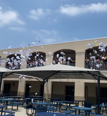
Another clear example is the emotions associated with seasons that are reflected in colors. This is shown in seasonal depression, or the Winter blues, a time of earlier nights and darker days. This causes a shift in the body clock that can result in harmful symptoms such as hypersomnia, oversleeping, or insomnia, the inability to sleep (Mayo Clinic). This shift in emotion is reflected in outfit choices as Emma Wang (10) agrees, “I think most people, including myself, tend to dress in cooler and duller colors during colder seasons. There’s almost like an unspoken color palette for each season, and it is easy to find a lot of blue, gray, and black during winter. I think this can also reflect one’s emotions, as I’m sure many go through a rough patch of seasonal depression around this time.”
To further deepen the connection of color to daily life, Pantone’s infamous annual color of the year exists to reflect the year with a single color. The selection is made with careful consideration of the global experience, to connect on a deeper level to human life (Pantone). This is perhaps best reflected in the color for 2019, Classic Blue. The color reflects the somewhat dreary year of the pandemic, and combines it with blue’s inherent calming nature. The color is meant to represent a stable and peaceful start to a new age that was unfamiliar globally (Pantone). The color for this year is Mocha Mousse. As the color is meant to represent feelings of contentment, the neutral color of a warm brown spoke to the participants at Pantone (Pantone). Ultimately, the concept of being able to resonate with a color out of millions when considering the events and emotions of a year simply emphasizes color’s connection with the mind.
Color is everywhere. In history, the present, and the future, color will always have its long-rooted associations. Thus, the emotional connections with each will continue, and the studies in the psychology of color will continue to grow. While the color’s effect on the brain has limited research, its universal nature leaves endless potential for further study.
