


How Color Psychology Affects Marketing
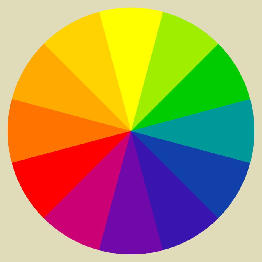
:This image is a color wheel that demonstrates the cool and warm colors. Credit: Monochromatic Color Scheme – Kathy K. Wylie Quilts
March 9, 2023
Have you ever had that feeling where suddenly you get a pang of hunger the minute you drive past a McDonalds or In and out, even though your stomach isn’t hungry. This is your subconscious responding to the logo’s colors. Therefore, it is known as color psychology.
So, what is color psychology? To be put in simple terms, it is the study of how color affects our mood, perception, and choices. This study researches how colors can provoke emotions or perceptions of a business, person, and environment as phrased in Very Well Mind.
A stop sign can give off the signal to indicate alertness of oncoming danger or traffic. Such as the color red can give the perception of confidence, alertness, and sense of control. Another example is the color blue, which can give off cold, calm, and serene undertones. Or the color pink which can stimulate emotions such as playfulness, femininity, innocence, and Romance. This is one of the main reasons why pink is used on Valentine’s Day and Breast Cancer Awareness.
Warm versus cool colors. Colors including red, yellow, and orange, or even brown are considered warm colors and are thought to stimulate excited emotions and comfort. On the opposite side of the visible light spectrum can be known as “Cool”. This can include blue, violet, and green. These colors are associated with calmness, coolness, and serenity as mentioned in a study from USC.
Beyond Color therapy, color psychology can be used for marketing and advertising products. For most marketers and companies their main focus is to captivate their potential customers. This can be through funny gimmicks, catchy slogans, promises, or colors. USC’s study describes that people make decisions within 90 seconds of their first impression or contact with a product, and color contributes up to 90 percent of their decision. According to USC, brands use the Isolation Effect. Which suggests that a bright or different color in a variety of monotone hues will stand out more. Brands that apply this to packages, products and commercials have much more success in driving customers to purchase.
Colors such as red and yellow can stimulate the feelings of hunger and playfulness. Companies such as Mcdonalds, In and Out or Carl’s Junior take action in the “Ketchup and Mustard Theory.” While it also reminds us of America’s most popular condiments according to insider.com. Through which the colors red and yellow subconsciously influence our brains to “drop what we are doing” and get a bite to eat. Another color commonly used in marketing is Red, known to be the color of passion, power, and courage. Brands such as Coca Cola and Louboutin’s are well known examples of this. While known for some of its most iconic tv shows that have appealed to the younger generation. Nickelodeon has used its iconic orange logo since 1984; that has continuously demonstrated playfulness and comfort for kids of all ages as mentioned in Logo Design Magazine.
An example of how cool colors can have a play in marketing, is a yoga or athletic company; that uses hues of blue throughout their products and stores. So, the moment you enter their store you instantly feel involved in a soothing environment with a slower pace of living. This is because blue is used to illustrate a serene and calming look, but blue is not only used for the emotions of tranquility, it can also be used to illustrate feelings of logic and communication. Well known social media and communication brands that use this are twitter, Facebook and LinkedIn. Another cooler on the “cooler side” is purple, which shows quality, luxury, and fascination.
Factors that influence color perception include age, gender, and culture. Such as the color white which can be associated with happiness and purity, like a woman who is wearing white on her wedding day. To someone from a different culture, which may have the perception of wearing white may signify sadness. In some cultures, white is associated with grief and death. An example is wearing white on a happy occasion or having a white garment on your head. Color psychology is a universal psychological factor influencing decisions, feedback, and memories worldwide. One study in 2020 tested the emotional perception of 4,598 people within 30 different countries. The study then found that people commonly associate certain colors with specific emotions. Such as Black which 51% of surveyed thought was associated with grief and 35% linked blue to feelings of serenity and relief according to Very Well Mind.


Karyss Park • Mar 23, 2023 at 7:31 AM
Very informative article with detailed research!
Emma Perron • Mar 23, 2023 at 7:24 AM
I never knew how much color was behind marketing. I loved that you wrote this article and gave examples.
Mylie Brown • Mar 9, 2023 at 7:28 AM
This is great! I didn’t know that colors played such a key role.