


Serenity and Rose Quartz
The 2016 Colors Of The Year
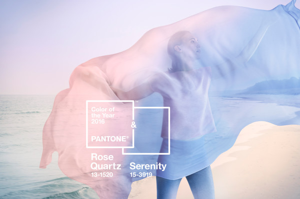
Pantone names Rose Quartz and Serenity as the 2016 Colors of the Year
January 6, 2016
For the first time in history, Pantone names not one, but two colors of the year for 2016, Serenity and Rose Quartz. The shade color experts have departed from the age-old tradition to predict that the blending of the two colors will be reflected in the following year’s fashion, home decor and design.
There are many mixed reactions to Pantone’s chosen colors this year and their reasoning behind the choices. Some praised the Pantone for thinking about worldwide issues in its selection, while many others felt that the company shouldn’t be taking such a political stance.
“In many parts of the world we are experiencing a gender blur as it relates to fashion, which has in turn impacted color trends throughout all other areas of design.”
“This more unilateral approach to color is coinciding with societal movements toward gender equality and fluidity, the consumers’ increased comfort with using color as a form of expression, which includes a generation that has less concern about being typecast or judged, and an open exchange of digital information that has opened our eyes to different approaches to color usage.” stated Leatrice Eiseman, the executive director of the Pantone Color Institute. As consumers seek mindfulness and well-being as an antidote to modern day stresses, welcoming colors that psychologically fulfill our yearning for reassurance and security are becoming more prominent.
Rose Quartz is a gentle and persuasive tone that conveys compassion and a sense of composure. Serenity is weightless and airy, like the expanse of the blue sky above us, bringing feelings of respite and relaxation even in turbulent times. When joined together, Rose Quartz and Serenity exemplify an inherent balance between an embracing rose tone and the peaceful blue, reflecting wellness and connection as well as a soothing sense of order and tranquility.
The combination of Serenity and Rose Quartz also challenges the traditional perceptions of color association held by many people around the globe.
In many parts of the world, we experience a gender blur as it relates to fashion, which has in turn impacted color trends throughout all other areas of design. This more unilateral approach to color is coinciding with societal movements towards gender equality. The consumer’s increased preference with using color as a form of expression, a generation that has less concern about being outcast or judged, and the open exchange of information online has opened Pantone’s eyes to different approaches to color usage.
“I believe that the choosing of both [Serenity and Rose Quartz] is a good choice because it brings both colors together and does not associate them with a specific gender like many people in society do today,” states Cassandra Scigliano (10)
The pairing of Rose Quartz and Serenity brings peacefulness and relaxation whether it is joined soft or hard surface material. Both colors appeal in all finishes, matte, metallic and glossy, and the engaging combo also combines easily with other tones including purples, greens, rich browns, and shades of yellow and pink. Pairing the two with in silver, gold, or hot brights adds more splash and sparkle.
Be sure to update your closets for the new year with these beautiful tones.